From a Design Perspective

I am a graphic designer by day (the jewelry thing is one of many side projects). For those of you that are not graphic designers, you may not be aware of a long-standing design software rivalry between Adobe InDesign and Quark Xpress. A little over a year ago I made the jump after 15 years of using Quark Xpress to using Adobe's InDesign. I have not once looked back on the decision.
Quark's customer service has been notoriously awful. I was once solicited with two different upgrade offers for their software that had two different prices with a difference of $50. I own two registered copies of the software, one at work and one for my computer at home, which is why I got two offers. It took major amounts of negotiations to get the lower price. If that wasn't bad enough, about two weeks after I bought the upgrades at the negotiated price, I received another offer to upgrade for $100 less than the price I paid. I did everything but write the president of Quark a letter. Note to Quark: if you solicit for upgrades and someone buys said upgrade, do not slap your customers in the face by sending them another e-mail two weeks later offering the same upgrade at a lower cost. Delete said customer from the secondary list. Morons.
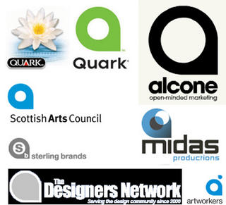
Anywho, I'll spare you the rest of the reasons why a year ago I switched to InDesign. I only use Xpress when I need to open my legacy documents to convert them to InDesign. Recently, Quark unveiled a highly publicized new logo. Personally, I'm not impressed with the design and, given my history and dismay with the company, I haven't been "moved" by the new logo. Today, I received an electronic newsletter to which I subscribe that had the following article about Quark's new logo. Hilarious!
"Sometimes a Logo Is Just a Logo" by Gene Gable (Creativepro.com)
Quark's new logo is strikingly similar to several others. Is it theft? A global conspiracy? Or a failure to follow basic design principles? Gene Gable gives you the dirt, including ways you can sidestep the same type of predicament.
"You might think that if observant designers around the world can post several similar logos within hours of Quark's public debut of the new logo, it should have been just as easy for Quark to have identified the same conflicts. Not necessarily so."
Here's a link to the complete story: http://www.creativepro.com/story/feature/23415.html?cprose=6-39

0 Comments:
Post a Comment
<< Home